“Following the market is much more simpler than you can imagine. When we get too bullish, we create a top. When we get too bearish, we create a bottom.”
— Avi Gilburt, The Market Pinball Wizard, Elliot Wave Trader
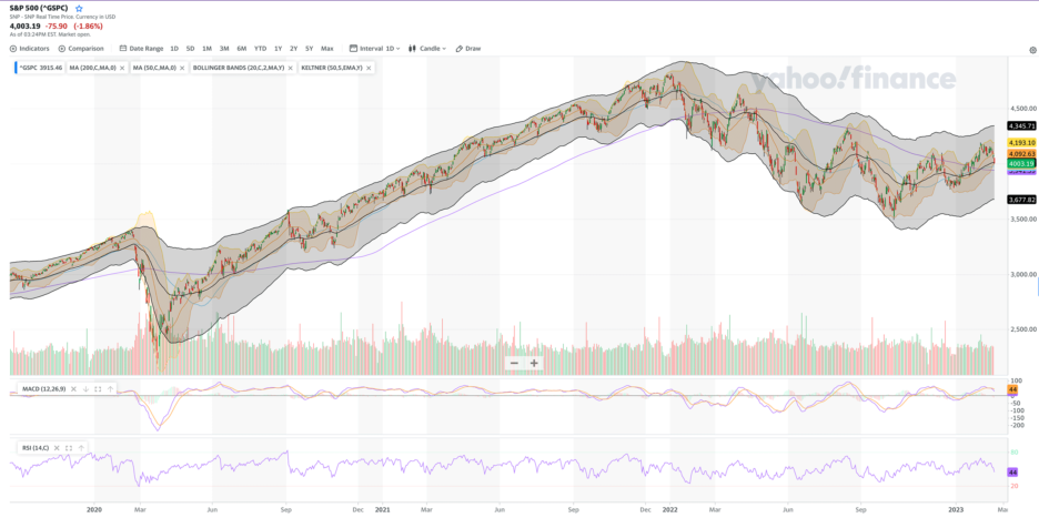
Notice the Bollinger Bands in the S&P 500 chart above. In the shorter term (a month or three) the index bounces between the top and bottom of that range. The medium term (a year or so) follows trends of higher highs and higher lows or vice versa. The longer term (a few years or more) the market bias is up. However, there are some exceptions. Buying the index in 1929. It took until 1954 to get back to the same level. Buying in 1999. The index got back to that level in 2007 but then got crushed and did not get back until 2013. One has to wonder if the 2022 peak will take years to eclipse …
See the chart in action: Yahoo Finance
The moral of the story is to buy on sale so you are paying a good price in case it is many years before the index achieves a new high of significance.
#AbideTheStrikePrice


